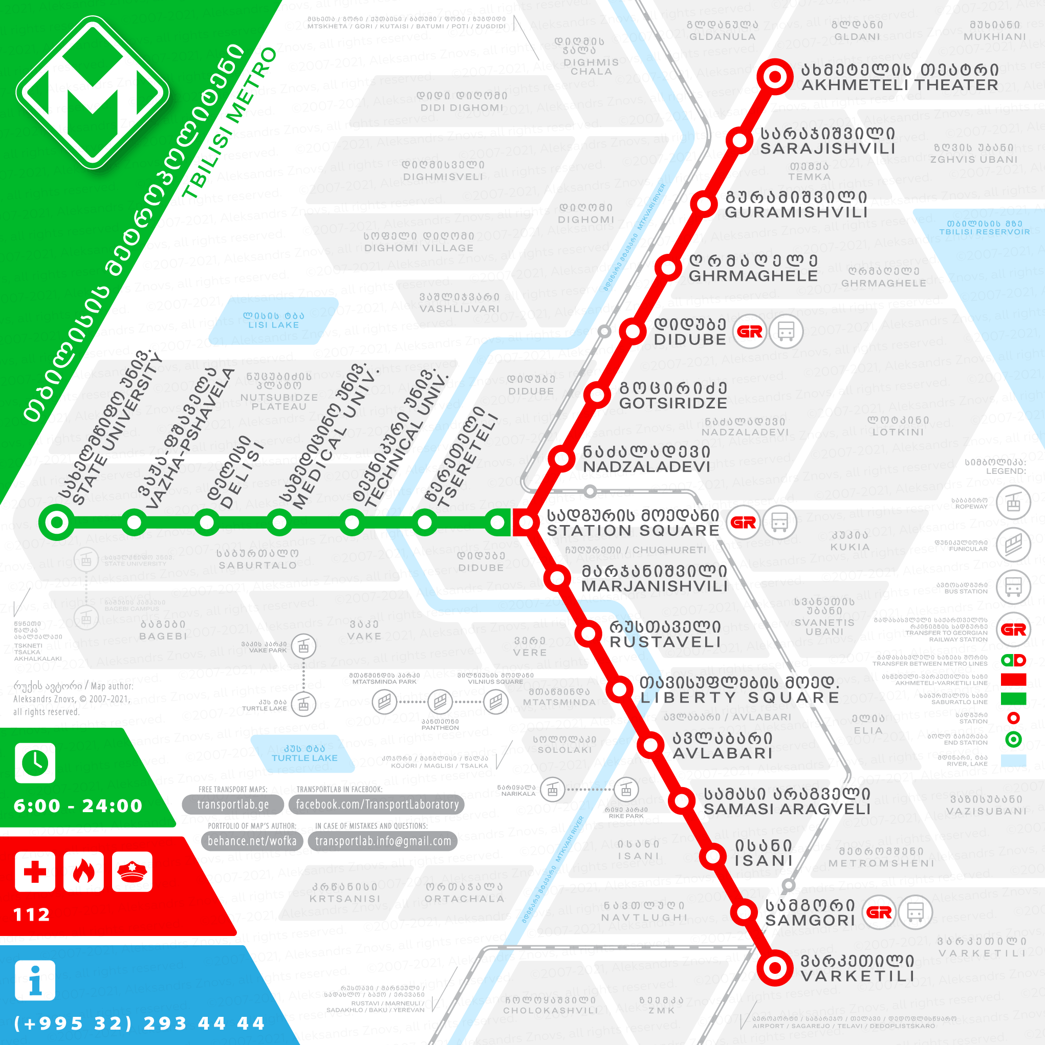
I made this Tbilisi Metro diagram some years ago for the contest for metro scheme to be placed at the doors of metro trains. The jury has chosen the other contestant, but I am happy for the possibility to participate. I still find my version better, it is why I am going to share it with you.
I found the old red logo of Tbilisi Metro (which kept by authorities from the Soviet times) quite old-fashioned and it is very similar to logos of some other metro systems, so I also offer my own design of the metro sign, which, in my humble opinion, is more stylish and not similar to another metro network brands. The sign implements M letter and the arrow, which shows “you must go underground”. I also changed the red colour to the green one, which is more positive and reminds of green transportation concept, which metro actually is about.
This network map is for non-commercial use only! To view or download a high-resolution map please click on the image below, then right-click and choose the action.


